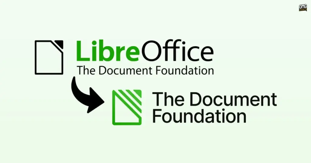
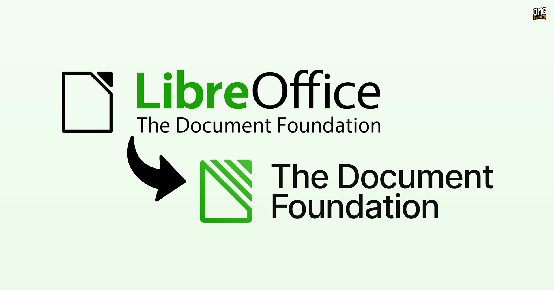
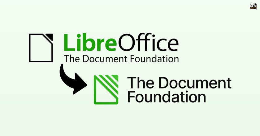
The Document Foundation, the charitable non-profit entity responsible for overseeing the development and stewardship of the LibreOffice office suite, has officially unveiled a comprehensive refresh of its visual identity. Marked by a distinct new logo, modernized typography, and an updated color palette, the change represents the first time since the foundation’s establishment in 2010 that the governing organization does not share a unified logotype and wordmark with LibreOffice itself. The move formally untangles the visual representation of the administrative body from the software application that has historically served as its most recognizable public output.
Under the new design framework, the foundation has established a standalone wordmark bearing the full name "The Document Foundation," rendered cleanly in the open-source typeface Inter. The typography is supported by an updated set of complementary brand colors, chosen to lend the organization a contemporary, cohesive, and clearly defined aesthetic. By departing from the visual motifs that have traditionally mirrored the LibreOffice brand, the foundation is taking a deliberate step toward presenting itself as an autonomous entity with a mission that stretches across the wider technology and public policy landscape.
The rationale behind the brand separation was detailed by Italo Vignoli, a founding member of The Document Foundation, who highlighted the practical necessity of giving the organization its own voice. Presenting the new visual assets, Vignoli emphasized that the foundation requires an identity suited to communicating as an established institution rather than being perceived solely as a software development project. He noted that the organization’s mandate extends well beyond the single product for which it is most widely recognized, making a clear visual distinction between the governing body and LibreOffice an essential evolution for its institutional growth.
For more than a decade, the public identity of The Document Foundation was deeply intertwined with LibreOffice, creating an environment where observers, users, and institutional partners frequently conflated the non-profit organization with the office suite it maintains. While this close association was instrumental in building credibility during the project’s formative years following its split from OpenOffice.org in 2010, the continued expansion of the foundation’s advocacy work has increasingly highlighted the limitations of sharing a singular visual brand. As the organization engages with regulatory bodies, standards committees, and public sector administrations, establishing a dedicated institutional identity has become an operational priority.
To execute the brand transformation, The Document Foundation partnered with URA Design, an independent design agency based in Berlin that specializes in open-source and public-interest technology projects. URA Design brings a notable track record within the digital rights and free software ecosystems, having previously crafted visual identities and user interfaces for high-profile initiatives such as Mozilla and the Tor Project. The agency’s founder also contributed to the design of Ubuntu’s desktop installer in earlier years, providing the team with deep practical familiarity regarding the cultural and community dynamics that govern open-source infrastructure projects.
The collaborative process resulted in a minimalist and functional identity system centered on clarity and broad digital adaptability. The adoption of Rasmus Andersson’s Inter font family reflects this philosophy, offering a typeface engineered specifically for legibility across computer screens, administrative documents, and diverse publication mediums. By pairing Inter with an updated color scheme, the redesign equips the foundation with a modern design architecture capable of functioning seamlessly across official correspondence, policy whitepapers, web portals, and public presentation environments.
The strategic shift to differentiate the parent organization from its flagship product offers an intriguing contrast to other high-profile branding movements within the open-source industry. Most notably, British software company Canonical pursued the exact opposite strategy during its own corporate rebranding effort. Rather than establishing visual distance between itself and its marquee operating system, Canonical elected to retire its long-standing corporate mark—which consisted of two nested purple circles—in favor of absorbing the Ubuntu "Circle of Friends" symbol directly into the primary Canonical wordmark.
While Canonical chose to consolidate corporate recognition around its most prominent commercial asset, The Document Foundation’s structural requirements as an independent non-profit necessitated the inverse approach. Where a commercial vendor often benefits from unifying enterprise offerings under a dominant product brand, a community foundation tasked with public advocacy and standards oversight faces different institutional imperatives. For The Document Foundation, preserving a separate identity allows the governance entity to represent broader public interest concerns without being seen merely as a product marketing arm.
Crucially, the foundation’s work encompasses critical areas of digital infrastructure that operate independently of LibreOffice’s immediate codebase. Central to this broader mission is the foundation’s ongoing stewardship and promotion of the Open Document Format (ODF), an international standard designed to ensure long-term document accessibility and platform independence. Through dedicated working groups and standards involvement, the foundation actively defends open standards against proprietary document lock-in, ensuring that digital records, public archives, and user documents remain accessible across different software environments without reliance on commercial vendor ecosystems.
In tandem with its technical contributions to standards bodies, The Document Foundation maintains an active advocacy presence within international public policy. The non-profit routinely interfaces with public sector organizations, educational institutions, and government administrations seeking to implement digital sovereignty strategies. In an era where public bodies are reassessing their reliance on proprietary software monopolies, the foundation advises decision-makers on the technical and legal frameworks needed to maintain complete control over their digital archives and operational software. This advisory and educational role requires an authoritative, neutral institutional posture that speaks beyond the scope of a desktop productivity application.
Despite the comprehensive nature of the foundation’s visual overhaul, the visual identity of LibreOffice itself remains completely unaffected. The application’s recognizable logo, product iconography, application-specific color schemes, and software interface elements will continue unchanged. By leaving the software’s identity intact, the foundation ensures that hundreds of millions of active users around the world will experience zero disruption or confusion in their daily interaction with the suite, maintaining continuous brand recognition across desktop installations and distribution channels.
The transition to the new corporate design is slated to proceed progressively across the foundation’s ecosystem over the coming months. Community members, designers, and media representatives can already review and download the refreshed brand assets directly from the foundation’s official distribution infrastructure at tdf.io/tdflogo. The gradual rollout will see the new typography, color guidelines, and wordmark integrated systematically across official web properties, documentation repositories, public governance records, community communication portals, and official social media presences.
 Linux & Open Source Solutions
ONLYOFFICE Desktop Editors 10.0 Released as Fully Rebuilt App With Decoupled AI Tools and Over 1,000 Bug Fixes
The developers behind ONLYOFFICE have officially released version 10.0 of ONLYOFFICE Desktop...
 Linux & Open Source Solutions
Canonical Releases Official Ubuntu Desktop Images for RISC-V Hardware Ahead of Ubuntu 26.10
Installing Ubuntu on RISC-V hardware is poised to become significantly more straightforward...
 Linux & Open Source Solutions
Era Arrives on Flathub as a New Rust-Powered Calendar Application for the GNOME Desktop
A new open-source calendaring client has entered the Linux application ecosystem. Named...