
As Apple launches its new iPhone Duo, the company is actively investigating software adjustments for Safari to better utilize the device’s unique outer display. The core technical challenge centers on finding a practical balance between expanding web content across more of the outer screen and ensuring that critical site navigation and interactive elements remain fully visible and usable. While Apple has already introduced targeted optimizations in its recent Safari 27.1 software release, user interface engineers and web standards teams continue to evaluate long-term solutions for how web pages interact with the device’s non-traditional aspect ratio and side-mounted browser controls.
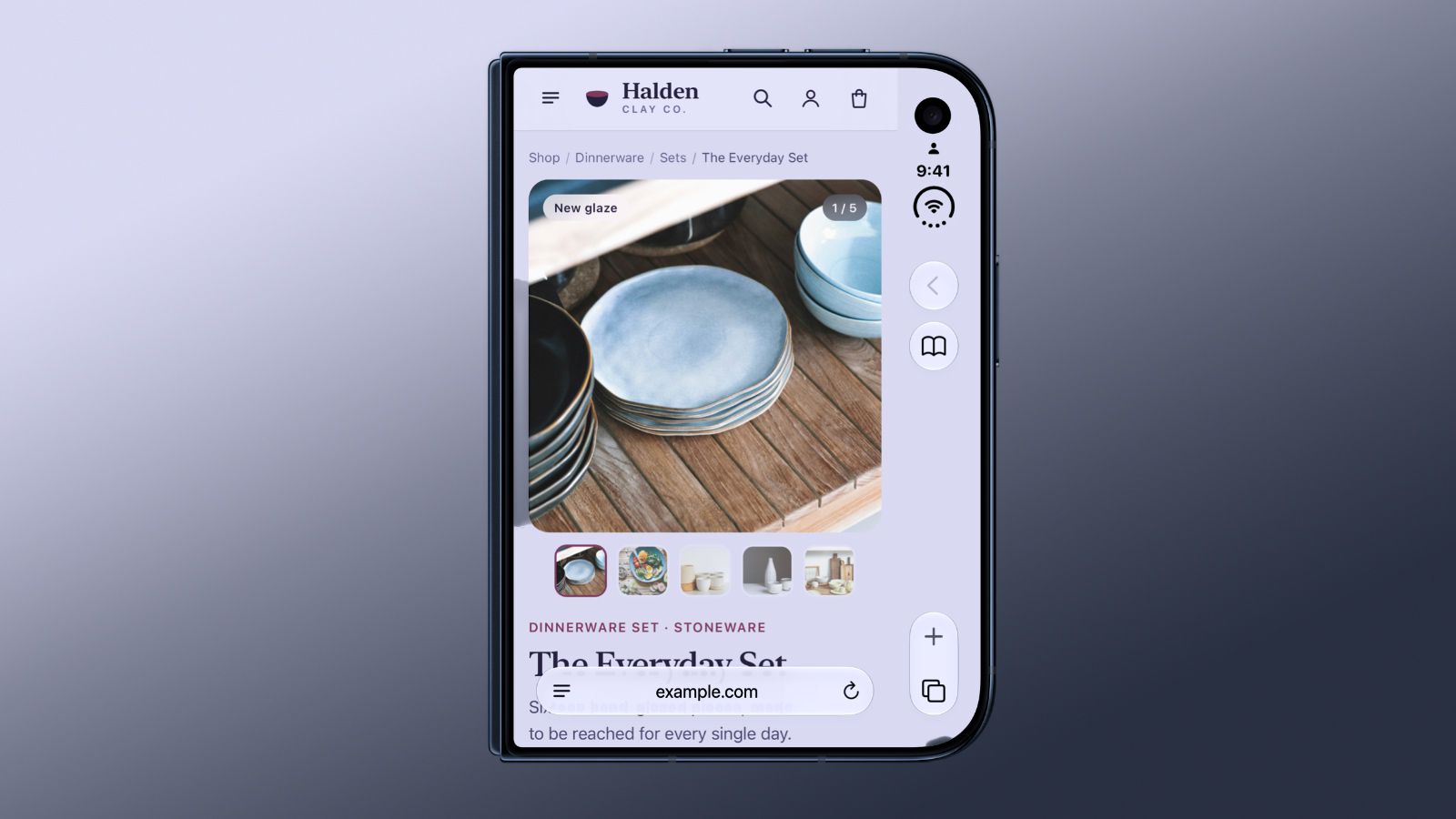
The layout challenge stems directly from the hardware geometry of the iPhone Duo’s outer display, which is noticeably shorter and wider than the screens found on conventional iPhone models. To maximize usable vertical real estate for reading web pages and running applications, Apple opted to position Safari’s primary browser controls along the side of the display rather than along the top or bottom margins. However, this orientation created a secondary user interface hurdle: determining how web pages should fill the physical space surrounding those side-mounted interface elements without obscuring content or rendering portions of a website completely inaccessible.
In the current release of Safari 27.1, Apple has taken a cautious approach to page layout on the outer display. Webpages are strictly restricted to the primary canvas area situated directly beside the side controls, while the remaining edge strip behind the controls is filled using the background color specified by the active website. While this conservative arrangement guarantees that no text, buttons, or media elements are hidden beneath the browser interface, it significantly limits the available horizontal width for content on an outer screen that was deliberately designed to offer a wider visual canvas.
The technical background and potential web standards solutions were addressed by Apple Web Developer Advocate Jen Simmons in an official WebKit blog post published on Friday, October 23, titled "WebKit Features for Safari 27.1." Simmons explained that an existing web standard parameter, viewport-fit="cover", could theoretically enable webpages to expand into areas that are normally reserved for system interface elements. When this attribute is enabled by site creators, a webpage canvas expands across the entire physical display area, extending directly beneath overlapping controls.
However, relying on viewport-fit="cover" requires website developers to carefully manage layout margins and safe area insets, leaving adequate padding around important content so that critical links, buttons, and text are not blocked by the interface. According to Simmons, Apple’s internal research and testing revealed that a vast majority of existing websites fail to properly implement these safety allowances across every edge of the screen. If Apple were to enforce full-bleed rendering using the existing standard without intervention, numerous websites would become broken or partially unreadable, with interactive links trapped underneath Safari’s side controls.
To resolve this issue without placing an unrealistic burden on web developers or breaking existing sites, Apple is investigating alternative rendering solutions that could offer site creators finer control with less risk of accidentally obscuring content. One prospective approach under evaluation would separate decorative page background layers from primary interactive content. Under such a system, a website’s header background, hero banner, or overall color scheme could span the full width of the physical screen—including the strip beneath the side controls—while navigation links, text, and active buttons remain strictly constrained within the unobstructed visual area. Apple has yet to settle on a final implementation, keeping the proposed change under active research while continuing to study web behavior.
Beyond the ongoing layout adjustments for the outer screen, Safari 27.1 introduces specialized built-in features engineered to take full advantage of the iPhone Duo’s foldable dual-screen architecture. A major addition in the update is automatic two-page document viewing when reading PDFs. When a user holds the iPhone Duo in a partially folded state—resembling an open physical book—Safari 27.1 automatically splits PDF documents into a side-by-side, two-page spread across the dual displays. If the user opens the device completely flat or closes it entirely, Safari seamlessly transitions the document back into a standard continuous single-page view.
Apple is also providing web developers with early experimental tools to construct custom responsive experiences tailored to the foldable hardware. Within Safari’s experimental feature flags, web developers can test early support for detecting the physical screen’s folding posture and dynamic angle. These experimental APIs allow web pages to recognize how the device is being held and automatically format or position web content around the middle fold or hinge area. While these posture-detection capabilities are currently available behind developer flags for testing, the proposed rendering changes regarding content beneath the side-mounted controls remain under active investigation.
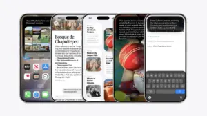
These web-focused software adaptations coincide with broader interface reveals across Apple’s application ecosystem in the lead-up to the hardware launch. On Tuesday, October 20, just three days before the official release date, Apple updated the App Store with new preview screenshots displaying its built-in first-party iOS applications running directly on the iPhone Duo. As reported by Juli Clover, these updated app screenshots provided the first comprehensive look at how core system applications adapt to the device’s landscape orientation and dual-screen form factor during day-to-day use, building upon earlier brief appearances in official marketing materials.
While software and browser teams work to optimize the dual-screen user experience, Apple’s retail operations have faced significant logistical challenges surrounding the device’s consumer debut. Prior to the official Friday, October 23 launch day, Apple retail staff members were instructed to actively advise customers against visiting retail stores in hopes of making walk-in purchases without a prior pre-order reservation. Apple Store employees were informed that locations were expected to have zero walk-in stock available on launch day, leading management to instruct staff to discourage unreserved shoppers from coming into stores expecting to buy a unit on the spot.
The severe shortage of retail walk-in inventory underscores broader supply chain constraints that have plagued the manufacturing of the dual-screen device. According to Bloomberg’s Mark Gurman, writing in his Power On newsletter, Apple was aware that the iPhone Duo would face "severe supply constraints" due to complex manufacturing challenges inherent to the hardware design. Gurman offered a sharp critique of Apple’s rollout strategy, stating that the decision to open pre-orders on Friday rather than delaying the sales launch until more inventory was manufactured and ready represented a "major mistake" on the company’s part.
Together, these software, developer, and operational developments illustrate the complex environment surrounding the launch of Apple’s new hardware platform. As WebKit engineers work to solve the geometric visual challenges of the wide outer screen without breaking web compatibility, Apple is simultaneously rolling out new posture-aware reading features in Safari 27.1, expanding developer feature flags, and managing tight retail inventory constraints. Apple’s ongoing research into side-control content integration highlights the delicate balancing act between introducing innovative multi-screen hardware and maintaining consistent standards across the broader web.
 macOS & Apple IT Support
Apple Releases HomeView Smart Home Hub: Detailed Look at Hardware, Features, and Setup Nuances
Apple officially released its new HomeView smart home hub on Friday, November...
 macOS & Apple IT Support
Anthropic Updates Usage Policy to Ban Cruel and Abusive Treatment of Claude AI Models
Artificial intelligence safety startup Anthropic has officially updated its Acceptable Use Policy,...
 macOS & Apple IT Support
Walmart Launches 2026 Black Friday Savings Event With Phased Online and In-Store Rollout
Walmart has officially launched its 2026 Black Friday shopping event, kicking off...