
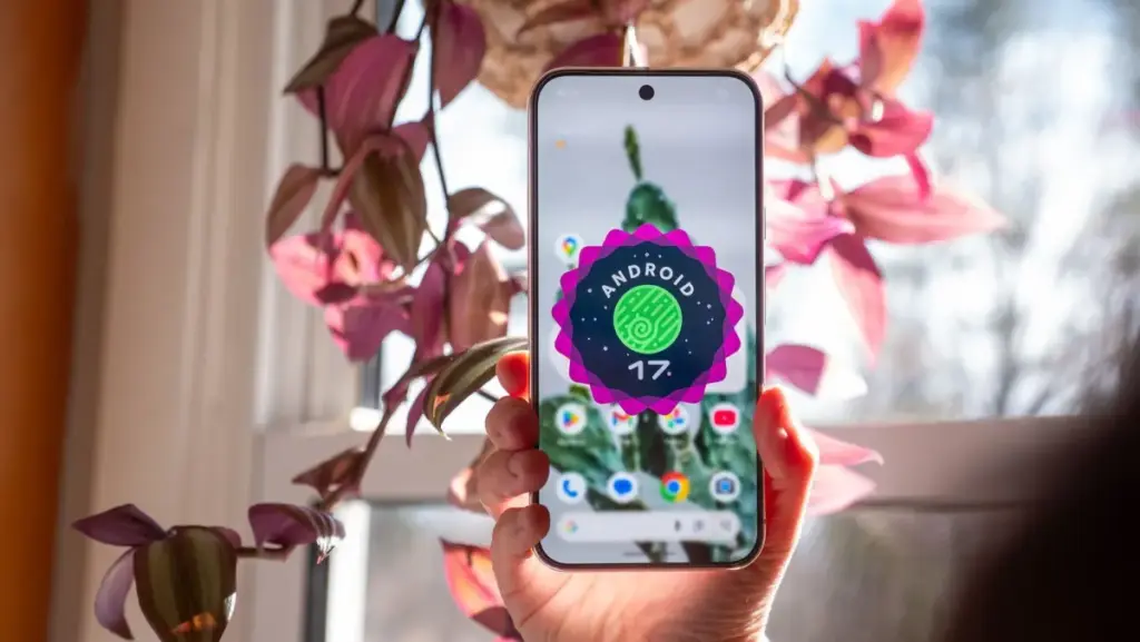
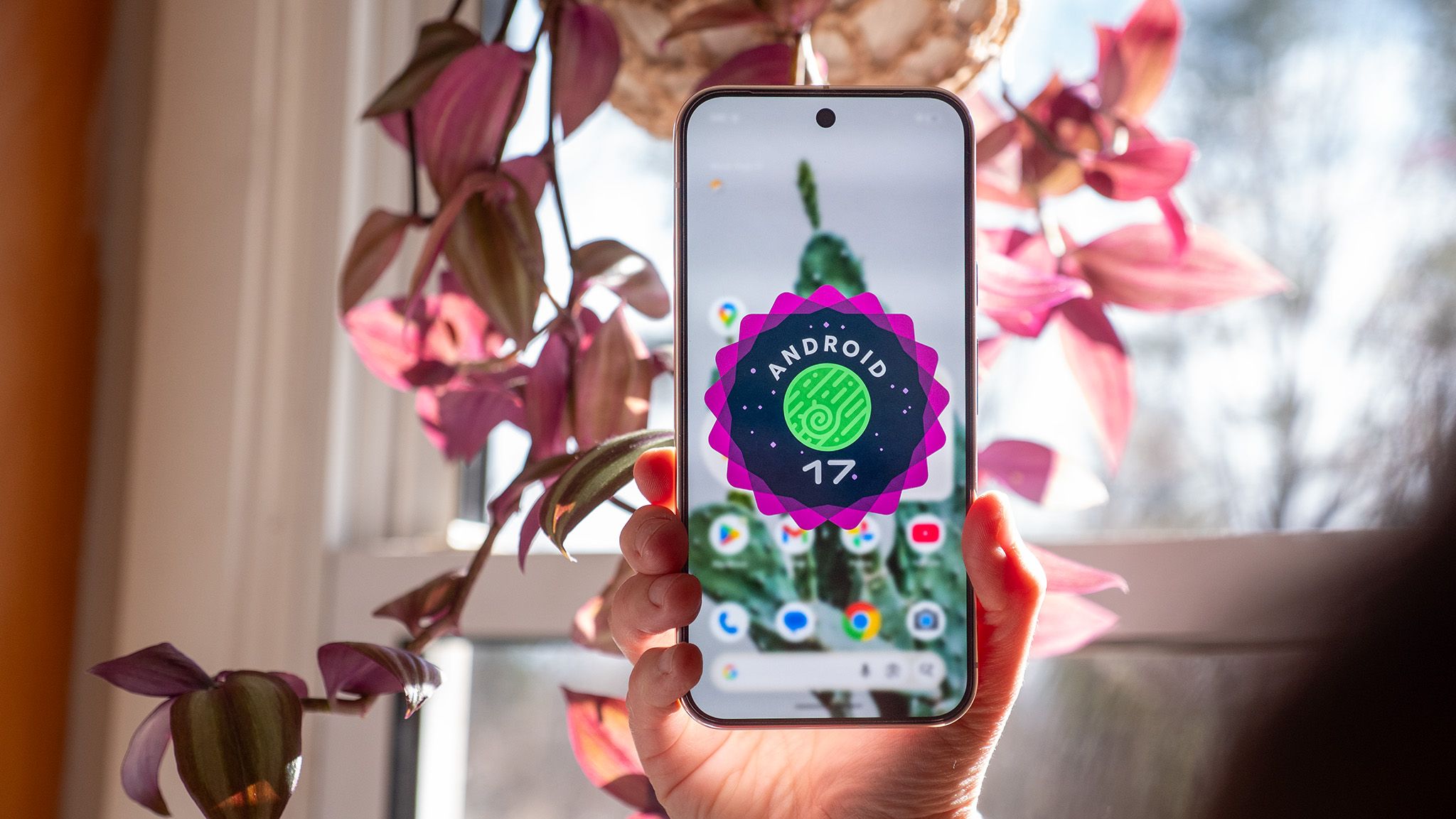
In a move that caught many in the tech industry off guard, Google has accelerated its software release schedule, officially rolling out the Android 17 Quarterly Platform Release 2 (QPR2) a full month ahead of its anticipated debut. This unexpected launch coincides with the November Pixel Drop, signaling a shift in how the search giant manages its mobile operating system’s lifecycle and iterative updates. The update is currently making its way to supported Pixel devices, spanning from the venerable Pixel 6a to the cutting-edge hardware of the Pixel 9 and Pixel 10 series.
The early arrival of Android 17 QPR2 follows an extensive beta testing phase that saw six distinct iterations. While these quarterly releases often focus on stability and backend refinements, QPR2 represents a more substantial leap forward, offering a suite of features that prioritize user agency, aesthetic flexibility, and sophisticated audio sharing. Detailed by industry analyst Mishaal Rahman and corroborated by early user reports, the update highlights Google’s ongoing effort to bridge the gap between "stock" Android and the highly customized skins offered by competing manufacturers.
Android Gains More Control Over Colors and Wallpapers
Since the introduction of "Material You" in Android 12, Google has championed an algorithmic approach to design, where system colors are automatically derived from the user’s wallpaper. While visually cohesive, some power users felt restricted by the limited palette options. Android 17 QPR2 addresses this by introducing a more robust and manual color customization system.
The centerpiece of this overhaul is a new rainbow hue slider located within the "Wallpaper & style" settings. This tool allows users to bypass preset color schemes entirely, selecting a specific custom system color that resonates with their personal preference. To complement this, Google has introduced four distinct intensity profiles: Neutral, Soft, Bright, and Bold. These options allow for a high degree of "theming" density; a user might choose a "Bold" red for a high-contrast look or a "Soft" pastel blue for a more understated interface.
Furthermore, the update enhances the synergy between the system theme and the background with adaptive light and dark wallpaper support. In previous versions, users often had to manually change their wallpaper when switching between light and dark modes to maintain a specific look. Now, compatible wallpaper collections can automatically toggle between light and dark variants. This ensures that the visual experience remains consistent and easy on the eyes, regardless of the time of day or the system-wide theme setting.
Status Bar and Quick Settings Finally Become More Useful
The status bar, often a cluttered area for active users, is receiving its most significant functional update in years. Google is granting users unprecedented control over which icons occupy this precious screen real estate. A newly minted settings page allows users to filter notification icons based on urgency. Options include displaying all icons, prioritizing only those deemed important by the system’s notification logic, or clearing the status bar of notification icons entirely for a "Zen" aesthetic.
Beyond notifications, the update allows for the toggling of individual system indicators. Users who find the battery percentage or the "vibrate" icon redundant can now hide them, leaving only the most essential information visible. This level of granularity reflects a broader trend in Android development toward minimalism and user-defined utility.
 Mobile Device Management (MDM) & Mobile OS
Google Maps Enhances Travel Planning with New ‘Ask Maps’ AI Features and European Expansion
The landscape of digital navigation is undergoing a significant transformation as Google...
 Mobile Device Management (MDM) & Mobile OS
Samsung’s Foray into the Googlebook Era: Leaked Benchmarks Reveal Snapdragon X Elite Power and Android 17 Integration
The landscape of portable computing is undergoing its most significant transformation in...
 Mobile Device Management (MDM) & Mobile OS
Samsung Reportedly Shifts Strategy Toward Premium Devices as Rising Component Costs Squeeze Budget Smartphone Margins
Samsung Electronics, the world’s largest smartphone manufacturer by volume, is reportedly preparing...